Wil Stacey

Graphics showpiece
Concept research


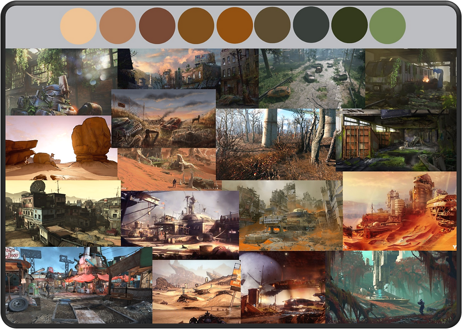
The target audience for the 3 designs I will be producing has been considered when deciding upon what to research and each image used within this section was chosen with the 12-16 yr. old target audience in mind. This is evident in each image selection above catering to the target audience to ensure my designs maintain the same standards when I draw my inspiration from these images. All images used above are taken directly from their respective games and all images used are free of any copyright.
An additional reason I chose Metro and Fallout in my research is due to their high amounts of popularity in the market/industry demonstrating a clear and successful post apocalyptic theming. This is evidenced when the games are regularly featured in top 10 and 20 post apocalyptic game lists, taking these 2 for example:
Cultured Vultures. (2020). 20 Best Post-Apocalyptic Games You Should Play. Available: https://culturedvultures.com/best-post-apocalyptic-games/. Last accessed 21/05/2021.
Jack Pursey. (2021). 10 Best Post-Apocalyptic Games Of All Time, Ranked. Available: https://gamerant.com/best-post-apocalyptic-games-ranked/. Last accessed 21/05/2021.


Moodboards
Post-apocalyptic weapons

Post-apocalyptic Environments

Post-apocalyptic Pick-ups

All images used in these mood boards do not breach any copyright laws and may be freely used within my research.
sketch Idea generation


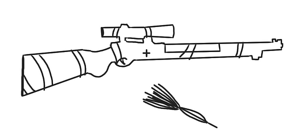
For this sketch, I started with an outline of a modern sniper that I traced out with the brush tool. I then altered the outline to accompany the post-apocalyptic theming which I wasn't satisfied with as the sniper looked too modern. Consequently, I redrew the outline of an older sniper which shape I liked much more. I then added a few minor details to ensure the design worked and to further develop the sketch.


Again on this sketch, I started with outlining a sentry to get a grasp on what look I would eventually go with. Much like the weapon design, I found the first sketch did not fit the post-apocalyptic theme well enough and looked too modern/sci-fi to fit the theming. I later settled on a box design with a sentry above it as well as the added post-apocalyptic theming.
Concept sketch production
Post-apocalyptic Healing weapon SKETCH

Post-apocalyptic eNVIRONMENT SKETCH

Post-apocalyptic pICK-UP SKETCH

cONCEPT REVIEWS
Noah Bellamy - GS20-4
Healing weapon- “try to make the gun look more friendly and not as dangerous, maybe add one little thing to change up the colours.”
Response- Including bright colouring on the weapon to make It appear less dangerous, conforming to the 12-16-year-old target audience.
Environment- “Instead of having only brown colouring add more colour”
Response- The weapon now has an orange tint with clouds added, all green foliage has been turned grey to show it is dead.
Pick-up- “Try to add a bit more colour to the sentry turret”
Response- Patches of orange rust and large red coloured areas added.
Finley Hayward - GS20-4
Healing weapon- “I like the designs they bring out the post-apocalyptic scenery I think a slightly more cartoon filer for the environment could fit the specification better”
Response- As the environment concept is a composite I have struggled to completely grasp the cartoon aspect however I have applied a cell-shaded type filter to many assets within the concept. Of course, it is only a concept, and if I were to apply this to a game a more cartoony art style would be implemented.
Kamil Bovaird - University Student
Healing weapon- “In terms of the weapon I understand that this is concept art however if I were to use this to model or as a 2D sprite I would want to have my edges all straight to start with and then add details like impurities in the wood body of the weapon, this can make either the modelling process easier or make it easier to draw different view angles of the weapon (where applicable).”
Response- I have since straightened up the edges of the concept and added tone to the wood.
Environment- “The environment can use some work, for example, the car placed into the scene looks off the scale to the adjacent buildings (too small). A good attempt at trying to mimic a cartoon style for your image however the textures on the floor, walls, and foliage is too detailed for this style and could use further work to match the similar visuals of the well-made sky.”
Response- As stated previously, the use of a composite makes it difficult to fulfil the cartoon style but I have made the car larger to fit the scale of the buildings.
Pick-up- “Similarly to the weapon, the turret should be drawn with straight lines but not only for making it easier to use for further development but also in this case the perspective, well placed 2 point perspective lines with then placed detailed onto the turret would make the drawing consistent and much more useful for the future.”
Response- I have straightened up lines within the concept and took on board all tips for the future.
Final concepts
Post-apocalyptic Healing weapon

This healing weapon is a handcrafted makeshift rifle that has been altered to shoot healing darts instead of its regular ammo type. The purpose of this weapon is to heal targets from large distances at a quick rate. As for ammo, small quantities of darts can be stored in the back strap of the weapon for rapid and easy access. Various rags provide stability to the weapon whilst also offering more grip to the user.
Post-apocalyptic eNVIRONMENT

For my environment concept, I decided that a composite piece would prove most effective to achieve the final concept envisioned. I created this using a wide range of photoshop tools and techniques ensuring to add the key assets of the post-apocalyptic theme, which I had researched prior.

Post-apocalyptic pICK-UP

This healing based ability pickup is a placeable box sentry which can target the wounded in a certain vicinity and shoot a healing dart at them. The pick-up is used as an AOE healing ability and can target multiple wounded at once healing groups at rapid speeds automatically.
Evaluation
Overall, I believe my concepts do a good job of fitting the client's requirements and target audience. They each contain a clear theme, a colour pallet that doesn’t contrast, and assets which signify healing and the overall game concept. One thing that I would improve if I redid these concepts is ensuring that the art style is displayed within all concepts. Here I feel that I could have done more with the cartoon style however the cell-shaded style fits well. One technical issue I encountered was my ability to blend certain assets in with the environment concept, I tackled this issue by watching tutorials on blending techniques within photoshop and eventually blended everything into a standard I was pleased with. In comparison to modern post-apocalyptic concept art, I would say that my piece reflects many of the same attributes only to a lower standard which is to be excepted.