Wil Stacey

Creative project w4
Introduction
This is the final week of production for my asset, it will consist of me finishing the modelling and texturing process and then importing the asset into unreal where I can set up a scene and animate the portal texture. My target for this week is to be finished with my asset and have it looking as good as possible in the time limit given.
You can download the executable file for my Dimensional Warp Gate Showcase above.
Timekeeping

I have continued to maintain the same time management throughout this week as the Gantt chart I previously created has proven to be an highly effective use of my time as I haven't needed to change anything.
Production log

Feedback
response
For the first update to my model I decided to act upon the feedback I had gathered in the first week of asset production, this included adjusting the symbol on top of the warp gate and adding to the base/stairs so it doesn't look as basic. I will continue to repeat this process of gaining feedback and acting upon it until I am happy with the final outcome. As for the comments about the control pad, I believe it won't fit the asset very well and will ruin the symmetry of the piece, I also gained a lot of comments about adding lettering/symbols to the frame of the gate, I plan to do this in my texturing stage.
Below is all of the feedback I will be acting upon through either modelling or texturing.

Door production


Now that I had responded to the feedback received in week 3, I began producing my door piece which would later move up and down in unreal to give the appearance of it opening and closing. I started modelling this asset using the extrude tool to shape and extend each individual piece, I would then rotate the end face and boolean difference the edge of the shape in order to shape the pieces into a circular shape.


Next, I repeated the steps above until each individual piece was positioned and shaped correctly making effective use of the clone tool as I progressed. I only needed to complete one side of the door as I would then mirror that side to produce the symmetrical door displayed above.
Dimensions and polygons


Displayed above is the dimensions of my asset as a whole, 436.778 x 299.658 x 269.110 (Length x Width x Height) measured in centimetres. My polycount can also be seen above, before starting on this asset I aimed to have my polycount under 100000 which I have ensured throughout by using techniques such as deleting unnecessary edges to optimize my asset to the best of my ability. We do this to make sure the asset is game ready and won't lag the game as a result of too many polygons.
UV & texture Production

These are my final textures displayed onto my models, the spires are untextured as I will be applying a material to them in unreal. Below are galleries containing all of the UVs and textures I have created.

Now that I had completed the modelling process I had to set up the UV's for the model so that I could texture it. Above is what the UV's looked like when I first pressed automatic on the UV editor create tab, as you can see it was a huge mess which I later realised could have been prevented if I completed the UV's as I modelled. After much time and effort I sectioned each piece of the model into different areas and had finished the main UV's of my asset, it was now ready to be textured.


The gallery above contains my completed UV as well as the textures I created using photoshop. To create this texture I firstly found a silver material which I then reshaped and altered using the clone stamp and rubber tools, I used this material for the main warp gate and its base. Next, I found a brass texture online which I used for the chains and main emblem. Finally, I added some alien symbols and blended them into the metal using various effects such as bevel and inner shadow, I added this in a circular format around the warp gate as a part of my feedback response from week 3. The images used in all of my textures are copyright free and been altered/edited by me in order to create the final textures.
Links to all images used within all of my textures are below.
http://www.psd-dude.com/tutorials/resources-images/new-free-metal-textures-/reflective-brushed-metal-foil-texture-free-1.jpg
https://filterforge.com/filters/9233.jpg
https://www.myfreetextures.com/wp-content/uploads/2011/06/illust32-900x675.jpg
https://img.freepik.com/free-vector/metal-texture-background_46250-146.jpg?size=626&ext=jpg
https://www.dreamstime.com/color-smoke-swirl-blue-green-purple-fog-whirl-dimensional-portal-motion-abstract-background-video186433247


With my main warp gate, UV and Texture completed it was time to move onto the door of the warp gate. This was a far simpler task which consisted of me reusing the materials I had previously used on the warp gate texture. As a side note, each texture displayed is 2048 x 2048 pixels with a bit depth of 32 and 4.2 megapixels.


This final UV and texture were the most simple of the 3 as it only consisted of 1 polygon disc, I created the texture using the clone stamp tool and turned down the opacity for a portal like appearance. Now it is time to export my models into FBX form so they are ready to be imported into Unreal Engine 4. Below I have evidenced this as well as my file management within week 4.
File export & management


All file management has been discussed within week 3 of the creative project and these images are an update on my files used in week 4.
Material setup


Above is all of the adjustments I have made to each material I imported within unreal. I have used the metallic and roughness options to give make my materials have a more realistic appearance and look like actual metal. I have also used the rotator on my inner portal materials as a simple yet effective way of animating the portal, this is demonstrated in the video below.
mARKETPLACE fx

To add to the atmosphere of my project and capture the sci-fi theme further I decided to import some visual effects that I found on the Epic Games Marketplace for free. I added a magic circle to the back of the portal and a storm to the background of the landscape which I think looks very effective. This asset is free of any copyright and can be used freely within my project.
https://www.unrealengine.com/marketplace/en-US/product/a36bac8b05004e999dd4b1d332501f49


Door Blueprint


This is the blueprint I produced to open and close the door once you are near the portal, it utilises the timeline node to animate the door sinking into the ground which can be seen in the blueprint above. I learnt how to create this in my games development lesson where we opened a door using the lerp rotate.
UI Element


I needed a way for the audience viewing my asset showcase to understand they could approach the warp gate for it to open, I did this through the use of UI and implemented a widget blueprint with some anchored text. I then added the necessary nodes to my third-person character and added a slight amount of opacity to the text.

Survey

I conducted this survey as a final attempt to gain feedback for my finished asset, I won't change anything from this point but will take all ratings and comments into consideration for future projects and if I were to do something similar to this later down the line. As you can see from the results above the majority of the audience voted 10 confirming that the asset works well aesthetically.


As stated above I will take these comments into consideration for the future, if I was ever given more time on this project I would act on these improvements and improve the asset. One good sign from these comments is that a lot of them are to change/add nothing which shows me that I at least added enough for there not to be obvious improvements.
LIcense

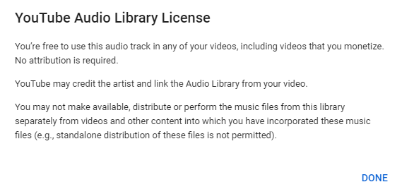
I have included music within my final showcase video that I have added from the YouTube editor which matches the Sci-Fi theme and adds to the overall effect of the video. This license for this audio track can be seen above detailing that no attribution is required and that the track is free to use.
Reflection
These 2 weeks of production have been extremely efficient and I have finished my asset to the best of my ability including mostly everything I set out to do within my timeframe. I believe I have produced a high-quality 3D model which caters to the brief well. I now know that I couldn't make the asset into a game mechanic as I ran out of time towards the end of the project but If was to include it the final 3D model would need to be less detailed and overall and therefore not as high quality. I am satisfied with what I have created and believe overall it shows a somewhat professional understanding of the software and production process as a whole. If I was to do this project again I would first produce my UV's alongside my model as that took up large quantities of time I could have spent doing other work like creating a teleportation mechanic. I would also add more sounds to my asset and possibly experiment with different materials and colour schemes.