Wil Stacey

CIR production
Introduction
Now that I have completed the pre-production of my CIR have now moved into my production months. These will consist of the creation and explanation of the whole artefact, including all necessary additional information. As I proceed through production I will constantly reflect on my planning to ensure my end product is effective and suitable.
management-
Trello / Gantt / Clockify

This is the Trello board I have created for my production so far, I will be providing regular updates on it as I progress which will display additions to my project as well as what I have and have not completed. As displayed above I will be starting the week off with my first task of creating the 1st set of models for my artefact using my checklist as I procede.


This is the Gantt chart I created for production, as mentioned in my pre-production, I will be updating and monitoring this chart as I progress through my production. As of now, I believe it will work effectively and little change will be made as I have split up the workload into chunks which works well for me.

Production Log
The first step I will commence with is the production of my main models, creating spheres to the correct realistic scale and ensuring they are optimised both for modelling and mobile implementation. I began this process starting with the core of the solar system, the sun.


I began by experimenting with what type of sphere I should use. This led me to smoothen out a cube and transfer the sphere's attributes to it creating a quad sphere that does not produce singularities at the poles.


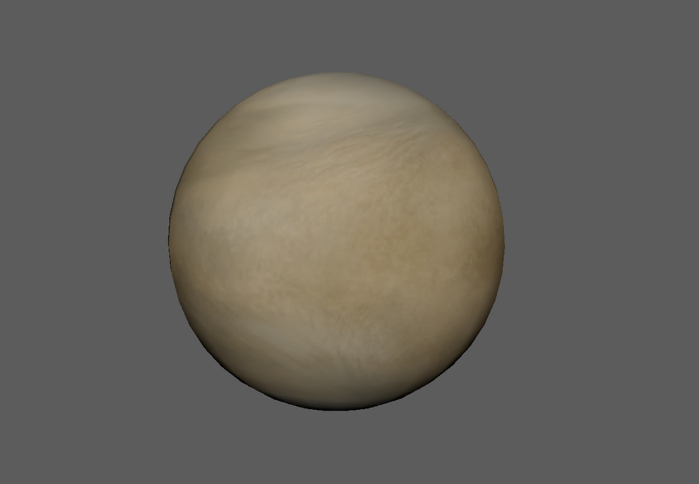
These 4 images above depict the final spheres in their realistic size and texturing, I will amend the look of them when they are imported into unreal using the material editor. They have all been texture mapped using a spherical UV and are not a majorly high resolution to maintain mobile optimisation.


Here is a more focused look at all of the textured spheres, each image texture was taken from the Planet Texture Maps Wiki - (https://planet-texture-maps.fandom.com/wiki/Planet_Texture_Maps_Wiki). These are free use assets that save me from creating each individual texture myself.


This is how I created Saturn's Rings. I first created a polygon in Maya and flattened it out by adjusting the radius and length, I then created a sphere that was larger than Saturn by a small amount and used the boolean difference function to create a hole in the cylinder. Finally, I applied the texture after adjusting the UVs with a planar mapping and positioning in photoshop. The image used is from Deviant Art and may be used freely without being sold. (https://www.deviantart.com/alpha-element/art/Stock-Image-Saturn-Rings-393767006)
Now that the planets have been created and textured I moved onto the additional features such as the moon and saturn's rings. To create the moon I followed the same procedure as the planets on a smaller scale and got the texture from the Planet Texture Maps Wiki once again - ((https://planet-texture-maps.fandom.com/wiki/Planet_Texture_Maps_Wiki).
Interview feedback
Much like the feedback I performed during pre-production, I decided to take the interview approach once again as I believe it offers the most useful results. These are the questions I asked the candidates.
1) How could these models be improved?
2) What would you like to see when these models are imported into Unreal?
3) Do the textures look semi-realistic to you? Y/N, If not why not?
Jude Rickard - College Student
1) I'd like to see the textures move and spin.
2) Some adjusting with Unreal's material editor to create a more realistic material
3) Y
Noah Bellamy - College Student
1) Bump maps could be included to add detail to the rough landscaping.
2) Rotating the models with accurate rotation speeds would be good.
3) Y
Elliott Broughton - College Student
1) The sun needs to glow and cast shadows on the other planets.
2) Maybe some effects on certain models to improve on them.
3) Y
Response- From this feedback, I have discovered that the audience would like me to add movement to the models as well as further improvement of the realism through the use of additional features such as bump maps, the material editor and VFX. I plan to include all of these additions as my project proceeds and will reflect upon their effectiveness when they have been produced.
management-
Trello / Gantt / Clockify


Now that I have completed my first month of production I will provide an update on my management strategies thus far. As displayed in the 2 images above I have now completed the models creation task on my Trello, ticking off all contents of the asset list I created. Therefore the 3 tasks that have since been moved over to the doing section are the tasks I will proceed with. To commence the second month I will produce the background of the scene and import it into unreal, next I will arrange and create the environment. Finally, I will set up the materials for each texture, if I complete all the tasks before the month is over I will work on my visual effects task to make effective use of the limited time I have.


Displayed above in the image gallery is evidence of my time usage within the month, I tracked this data using Clockify, with the aim to spend at least 2 hours on the project each working day. The days when I didn't do work were primarily days when I was busy with my job and other duties. I have been made up for these days by spending longer amounts of time on my available days.

I have decided to alter my Gantt chart following this month's production as some of the targets were unobtainable, this Gantt chart better fits my schedule and makes more sense in terms of the order. I will continue to monitor my management methods as I proceed to alter them when needed.
Month 1 Reflection
Looking back on this first month of production I think I have made a somewhat good start to my artefact production and project as a whole, the time I dedicated to making improvements for my pre-production was highly beneficial and has given me a better idea of what I would like to achieve proceeding onwards. If I were to attempt this month again I would ensure I am ready to start production before it arrives giving me a better headstart and allowing me to make more additions later down the line.
Month 2

Moving into month 2 of production I am now moving into unreal, firstly I created a new blank project with no starter content to keep the file size low. To maintain a professional and easy to work with project I next created the folders I would need during production, these can be seen in the image above as well as the new game mode and level I created.


The 3 images above display my imported models, these consist of textures, materials and meshes. I have arranged these into the correct folders and given each an appropriate name to maintain an easy to work with sorting system and keep my project professional.


Now that the models have been imported I can now work on adjusting each material where needed, I started this process by adding the bump map to Mercury to give it more of a rough aesthetic.
Next, I ensured Saturn's ring's opacity was working correctly and had an appearance I was satisfied with.
Lastly, some of the planets are gaseous and I wanted to better represent that within unreal, to do this I used the Fresnel node to give a blurry appearance.

As stated in the feedback I gathered during month 1, I want the planets to rotate to better assist the realism of the artefact. This required me to find the various rotation speeds of each planet and match them to my models as accurately as possible. Displayed below is the blueprinting I developed to create this rotation and the varying speeds.


For the space environment, I needed to create a star-filled void which was semi-realistic. I decided to go with the cube map approach to this task (a texture expressed on the face of a hexahedral virtual cube) as I wanted to become more experienced with this method and it isn't very time-intensive. Following the order of the gallery above, I first set up my photoshop canvas with the dimensions 4096 x 3072 pixels and I then created a 1024 x 1024 square to shape the guideline using the ruler tool. Next, I applied a dark tone of blue to the background and created clouds using the Photoshop filter. Once I was happy with the layout of the clouds I applied a colour dodge blend mode and erased with varied opacity to ensure the cloud's edges looked natural. I then drew stars with a scattered brush irregularly. After that I created a canvas with the dimensions 6144 x 1024 and placed the faces in order, using NVIDIA's texture tool exporter to create a DDS file which I imported unreal and applied to my skybox blueprint.


Now I am ready to start the setup of my environment and to start adjusting the layout and aesthetic of my artefact as a whole, I first placed the planets in order with a semi-realistic distance apart. I decided to scale down the distance between each planet as I believe this heightens the experience instead of them being drastically far apart and out of view.

Now I am ready to start the setup of my environment and to start adjusting the layout and aesthetic of my artefact as a whole, I first placed the planets in order with a semi-realistic distance apart. I decided to scale down the distance between each planet as I believe this heightens the experience instead of them being drastically far apart and out of view.
This is the demo video I have created in order to get some feedback on my artefact so far in the hopes of gathering new ideas and discovering what the audience like and dislike about my early build. This video is accompanied by a survey I created in order to gather the appropriate responses.
Interview feedback

Displayed in the image above is the first question I asked during this feedback. The majority of responses rated my artefact a 4/5 which at this stage I was happy with.

-Make it possible for the player to fast travel between planets
-Maybe up the speed of the ship so that there is less time between each planet as it was a little slow
-sound/music
-Maybe add a little more to do like interacting with the planets and learning about them.
-Change the location of the menu to the left side and make it smaller, allowing the player to see more of the animation in the background
-If you could have the planets rotating or orbiting the sun that would be cool.
-Make background stars brighter
-Maybe more UI at the start with more insight into what you are supposed to be doing
-The handling seemed janky and stuttery not sure if it was the video. Not too sure what the point is as you just seem to be flying around some oddly small planets in a cube
-Maybe a way to interact with the planets to learn about each one
-When you arrive at the planets, show some information related to it
-Improve the Menu buttons, colour and Fonts

I wanted more of an idea of existing design choices when asking the following questions and believe most responses were good and favourable. The highest percentage of answers for this question was average meaning I should not need to adjust the speed of my cinematic.

For this question I wanted more of an opinion of the models and textures thus far, the average rating was once again 4 which I hope to improve on upon completion of the artefact.

This question proves that my colour scheme is suitable for its purpose which will be taken into consideration mainly in the future creation/improvements of my UI.

-The boxes seemed very pastel and did not fit with the more industrial space theme
-I'd try and increase the difference in scale between the player and the planets
-Dull, brighter colours.
In reflection on these comments, I plan to adjust the UI's colouring and style which will be documented in a future section. I have also since increased the camera distance from the player to capture a wider scope of the environment when navigating it.

-Like the emissive material on the sun, planets should be scaled up and distanced a bit more to give a higher sense of realism
-I really like a big sun
-The sun is obviously quite bright, with the planets being this close to the sun you should probably play around with light reflections a bit, as of now they seem like dark textures, they're nice textures but it seems dim lit in comparison to the sun when the light should be reflecting off these in theory
-I really like the emissive light that the sun/planets give and I think that is really effective
-Overall it adds a good effect, the lighting could do with a bit of cleaning up and with some simple light fixtures you could have light coming from the background stars.
-Needs a navigation system, objectives and information about what you are doing.
-Maybe go deeper into how the product is educational, I get that it isn't finished yet so you might not have added this yet but rn it seems quite basic in this area
These additional notes further denote upcoming improvements as well as showcasing what the audience enjoys about the artefact at this early stage of development.
Next, I asked a more helpful question in order to understand what the audience would improve about my current build. A lot of the responses detailed additions I have yet to add which was a good sign for the future of my artefact, as for the other responses they may be considered in the event I have time to spare.


When testing my artefact and navigating through the environment I felt as though it seemed too empty, to combat this I wanted to add some effective particles which fill the space as well as adding a greater sense of dimension to the piece. I have imported these particles from the unreal engine marketplace, they are originally fireflies but with some adjustment to the settings and design, I have created stars/dust particles I am happy are effective within the scene.
management-
Trello / Gantt / Clockify

I am now on my 3rd month of production and have adjusted my Trello accordingly. The main tasks left to complete are displayed in the doing section and will be completed by the end of the month.


I have continued to track my time usage throughout this month and plan to until the end of production. As for my time efficiency, I am attempting to make the most out of my time within college as this is where most of my hours during production are spent.
Month 2 Reflection
Reflecting back on month 2 of production I believe this month has been highly productive as I am starting to pick up the pace of production, my artefact is starting to come together a lot more at this stage and I am happy with how it is turning out thus far.
Furthermore, my time usage has been a lot more efficient this month but could still use some improvement in certain areas such as my focus on work during the weekend. Heading into month 3 I am confident this project will be completed to a good standard but would like to make more additions in the future to further improve the final product.
Month 3


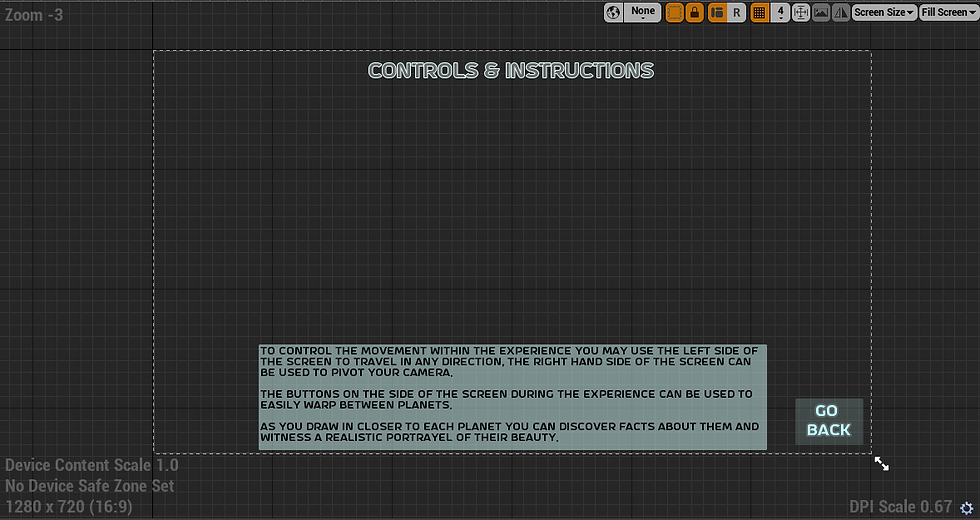
To commence month 3 I began producing my final UI widgets, this included all of the widgets displayed in the first image. I have created these widgets with many considerations in mind such as feedback gathered, theming and existing products. The blueprinting I have produced allows the user to easily navigate the menus as well as the environment through teleportation buttons relating to each planet.

The blueprinting above handles the cinematic I created to pan around the environment during the introduction, the animation is stopped once the UI is interacted with.

These nodes control the planet information UI and when it appears. Once the player gets close enough to a planet the UI will be displayed and exiting the same volume will remove the UI. When reflecting back on this I have discovered this was a long-winded approach and could have been created much more efficiently. The UI that displays each planets facts and information is captured in the gallery below..


Overall Summary
Overall I believe this project turned well and I have achieved what I planned to under the expectations of the brief. If I were to tackle this project again however there is a lot I would do differently in order to finish with a more desired outcome. I think my project was affected due to the setback of not having access to Augmented Reality capabilities which could have been solved by more effective preplanning. As well as this the choice to have a mobile-based artefact also limits me in certain areas but I still believe is a well-supported choice considering the nature of the brief and client. As for general processes and management of the project, I think I have kept a good standard throughout but have learnt about my personal timing strategies and how to manage myself better which I will use in future projects.
If I were to attempt this project again I would probably start by choosing a topic I am more interested in and develop an original concept based on it. With this current project although I found it somewhat interesting I often found myself not enjoying the creation of it which isn't common in my usual creative process. This led me to be compliant in certain areas, not producing the best work I am capable of.